Heroverse Brand Design
Alberta University of the Arts
Instructor: Kelly Hartman
Group Members: Valeria Gutierrez
December 2025
This branding project was completed in my 3rd year Typography class, where we were challenged to explore the power of typography to communicate both literally (the written word) and visually (as aesthetic). We were to use typography to brand and design all the communication elements around an arts event/festival. All photography and graphics for the deliverables must be secondary: mainly simple shapes, lines, dots, etc.
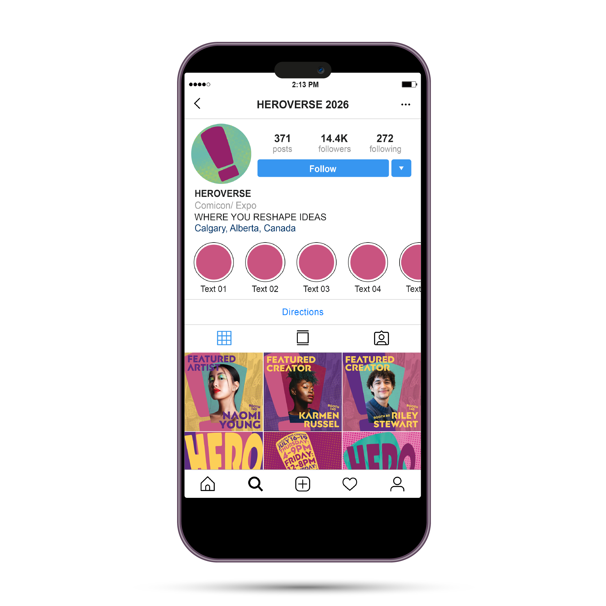
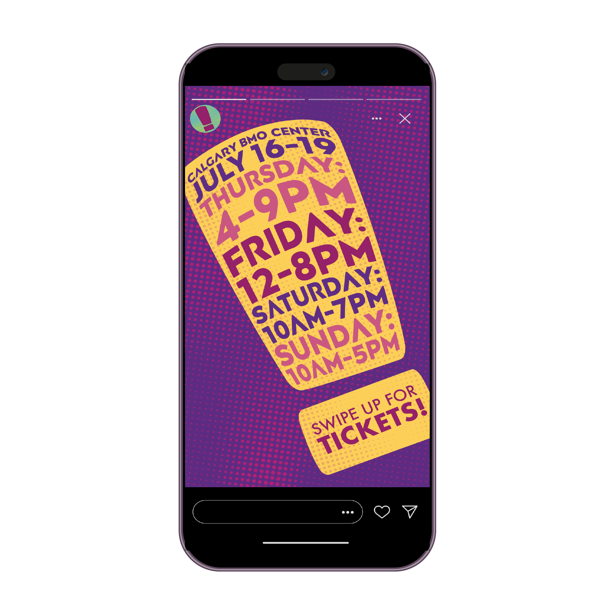
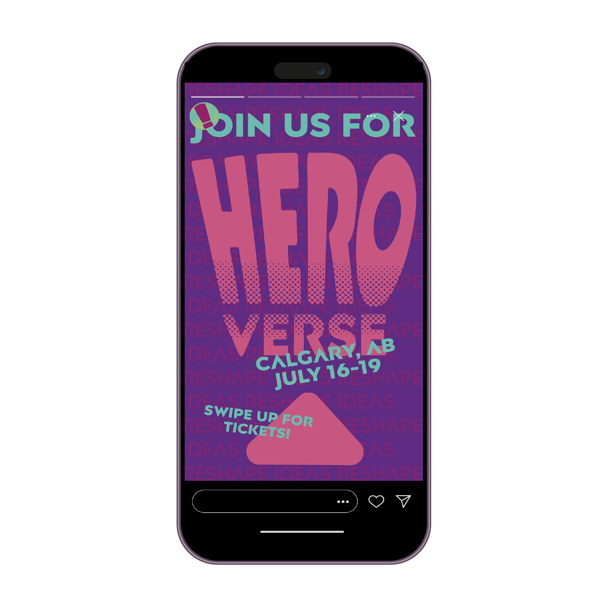
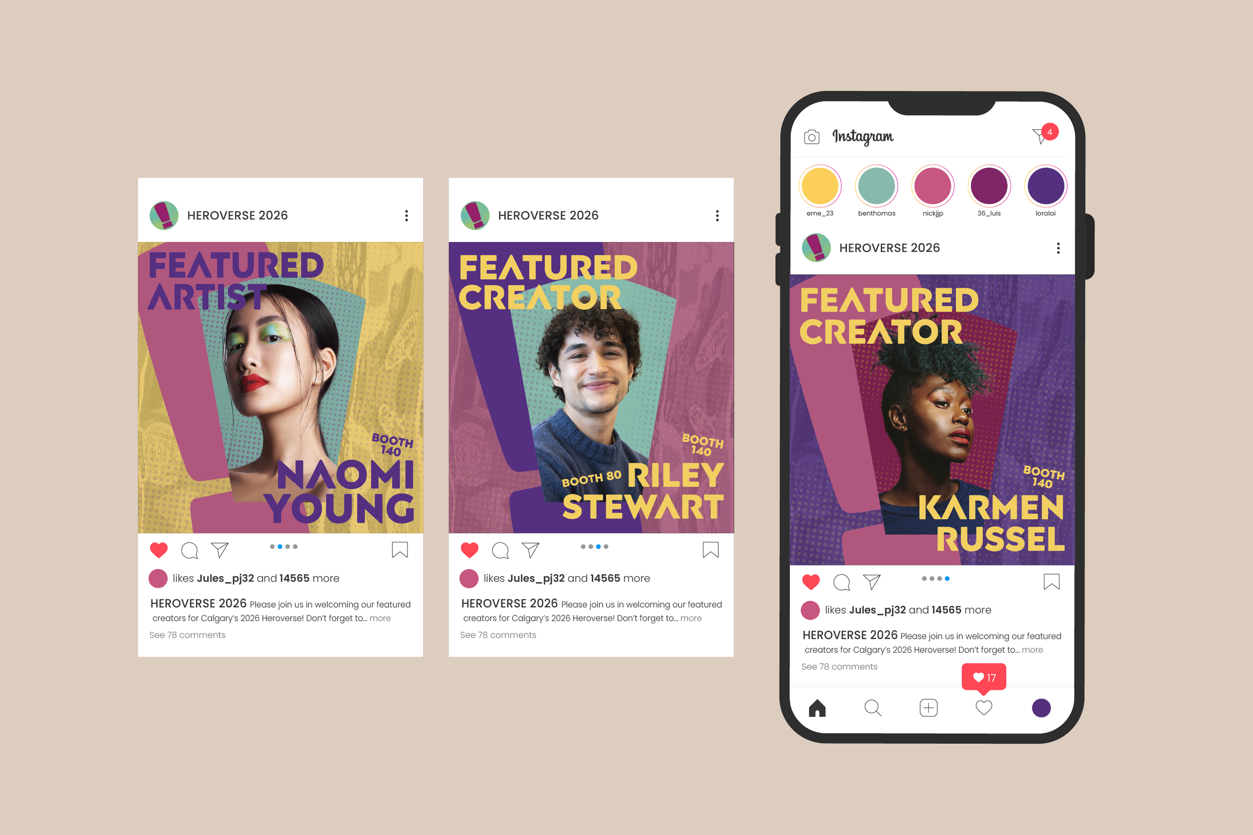
HEROVERSE is an inclusive arts and pop-culture expo designed to celebrate creators and fans who break boundaries, re-imagine representation, and push the comic genre beyond traditional binaries. Centred on the idea of “reshaping ideas,” the event invites attendees to explore a hero narrative that reflects their identity, power, and imagination— no matter their gender, orientation, or background.
The final deliverables of the project were split evenly between me and my partner. While we both collaborated through every stage of the assignment, my main contributions to the final products were on the apparel, app design, social media, and flip-book categories.
Symbol & Logo

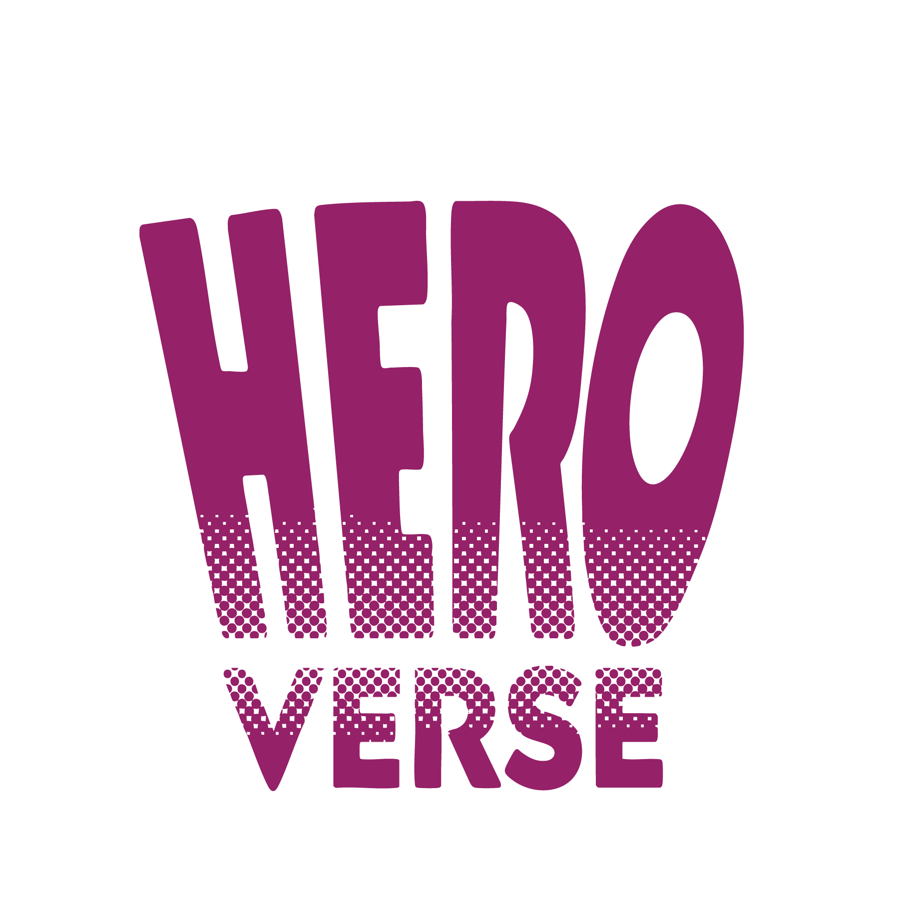
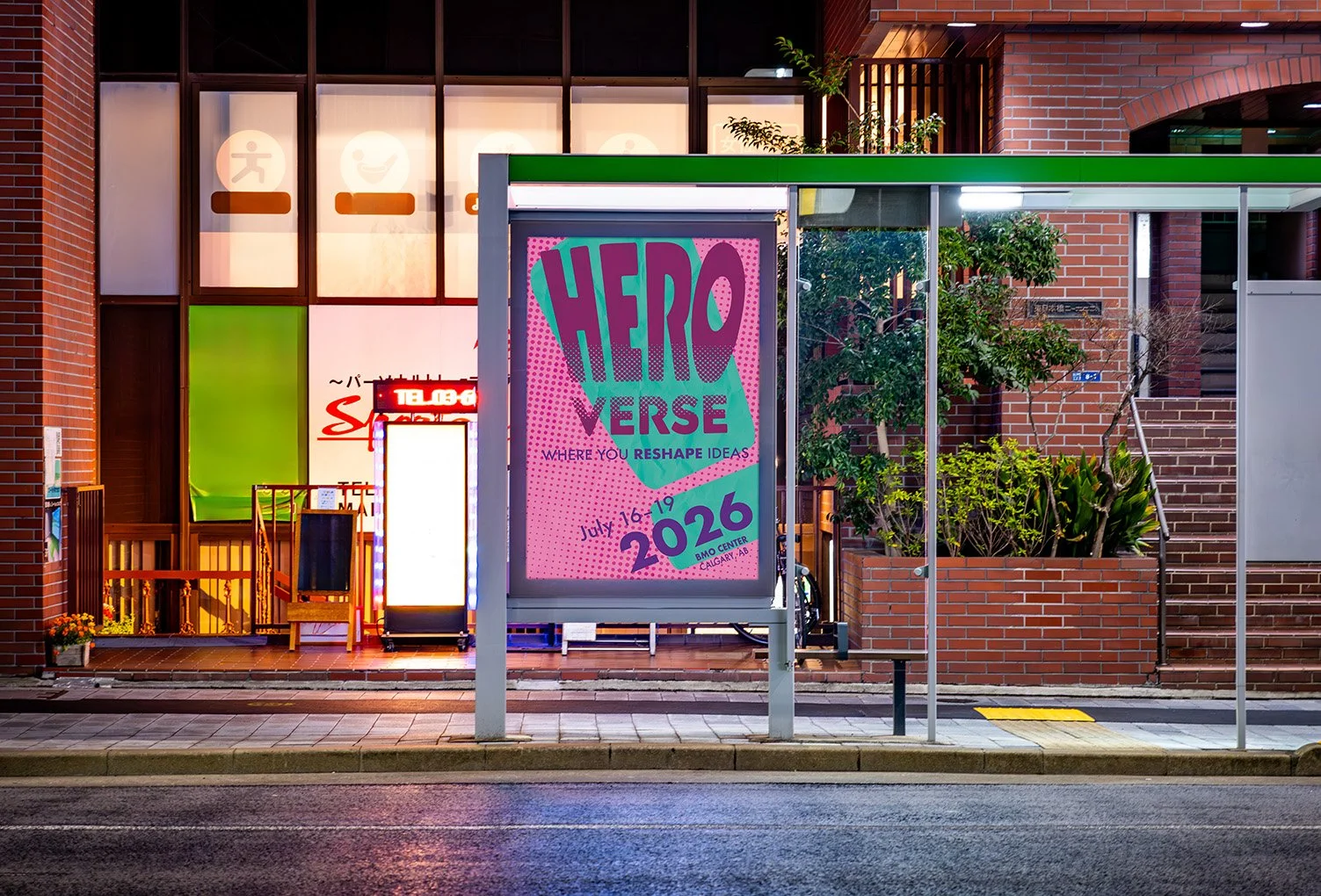
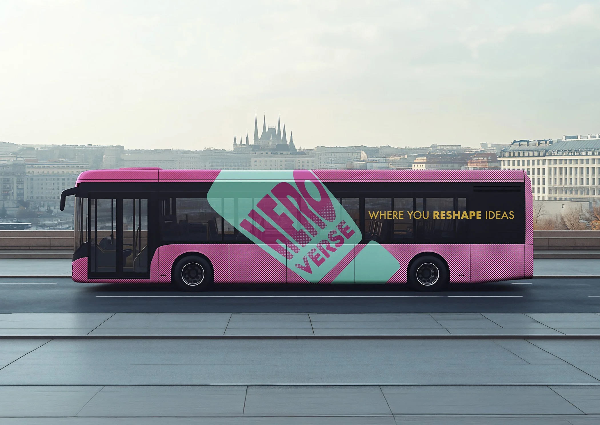
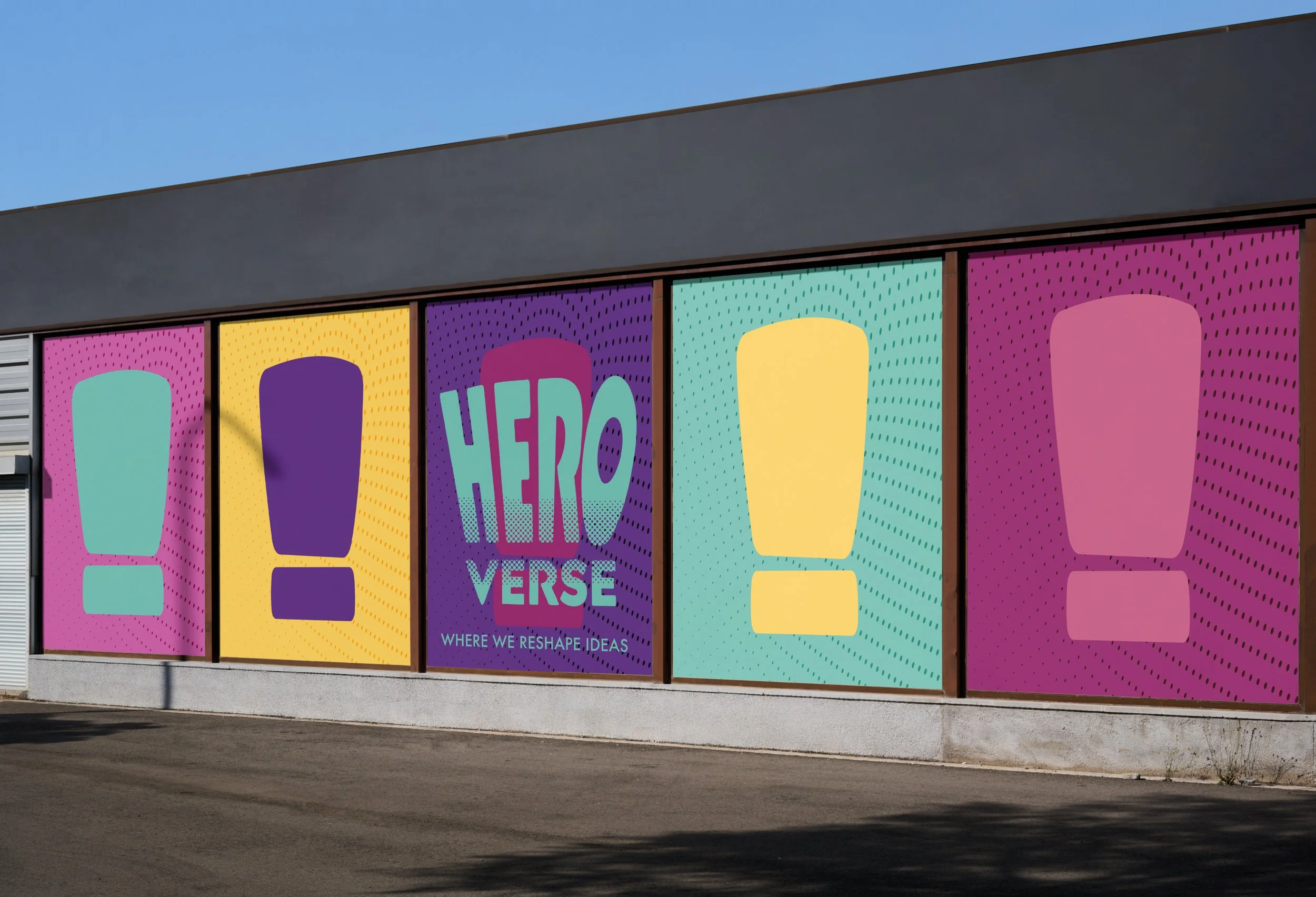
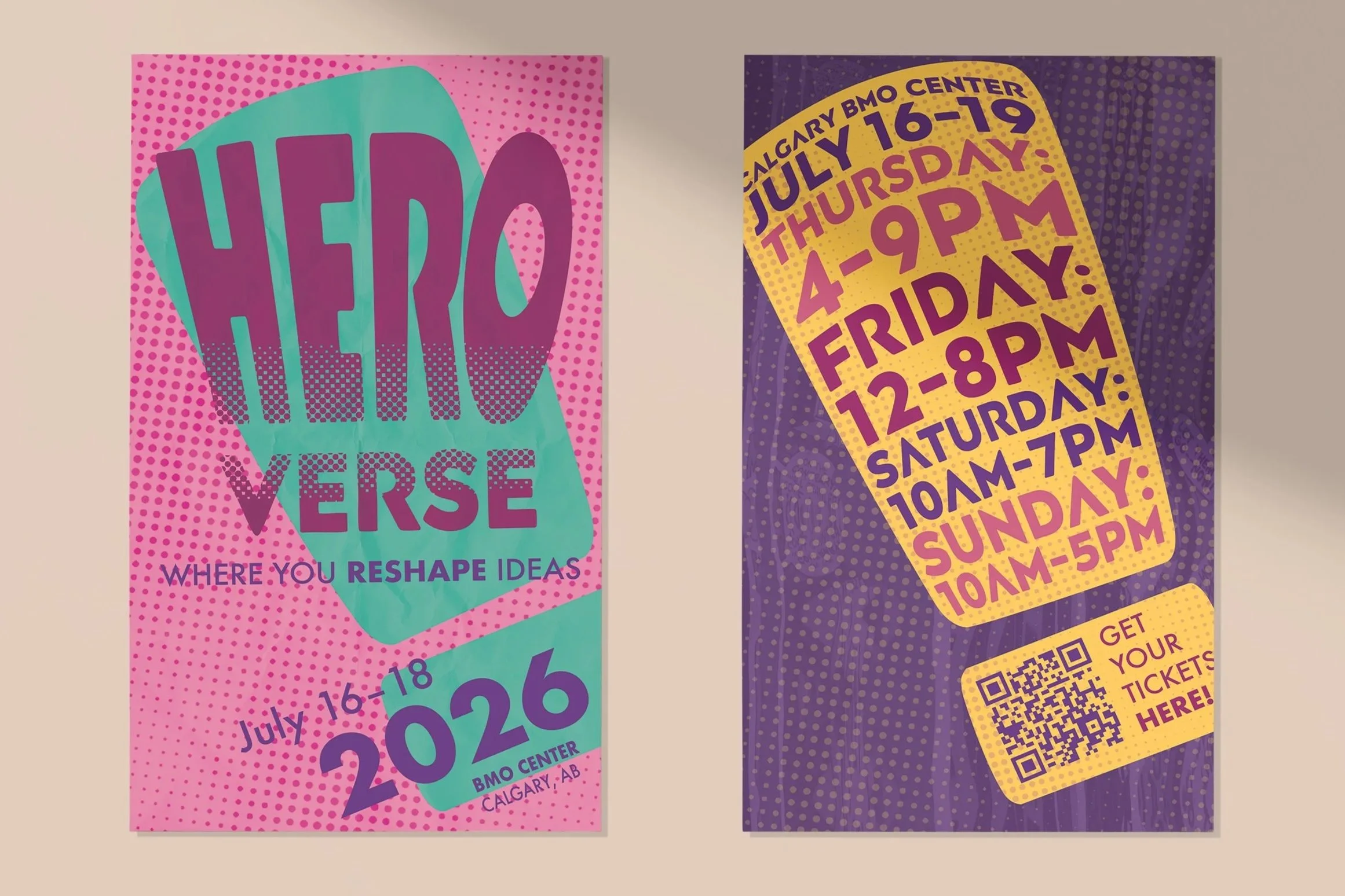
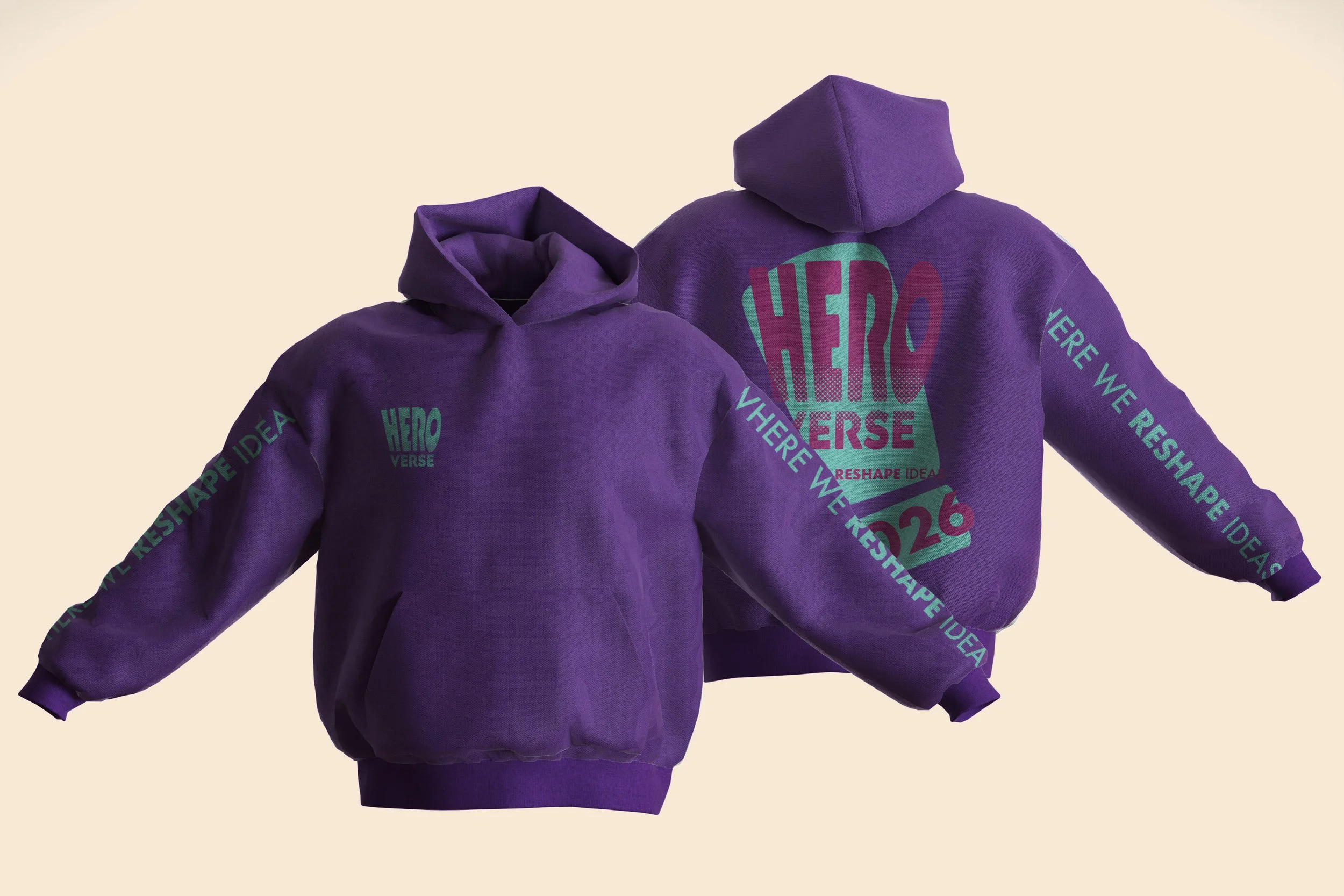
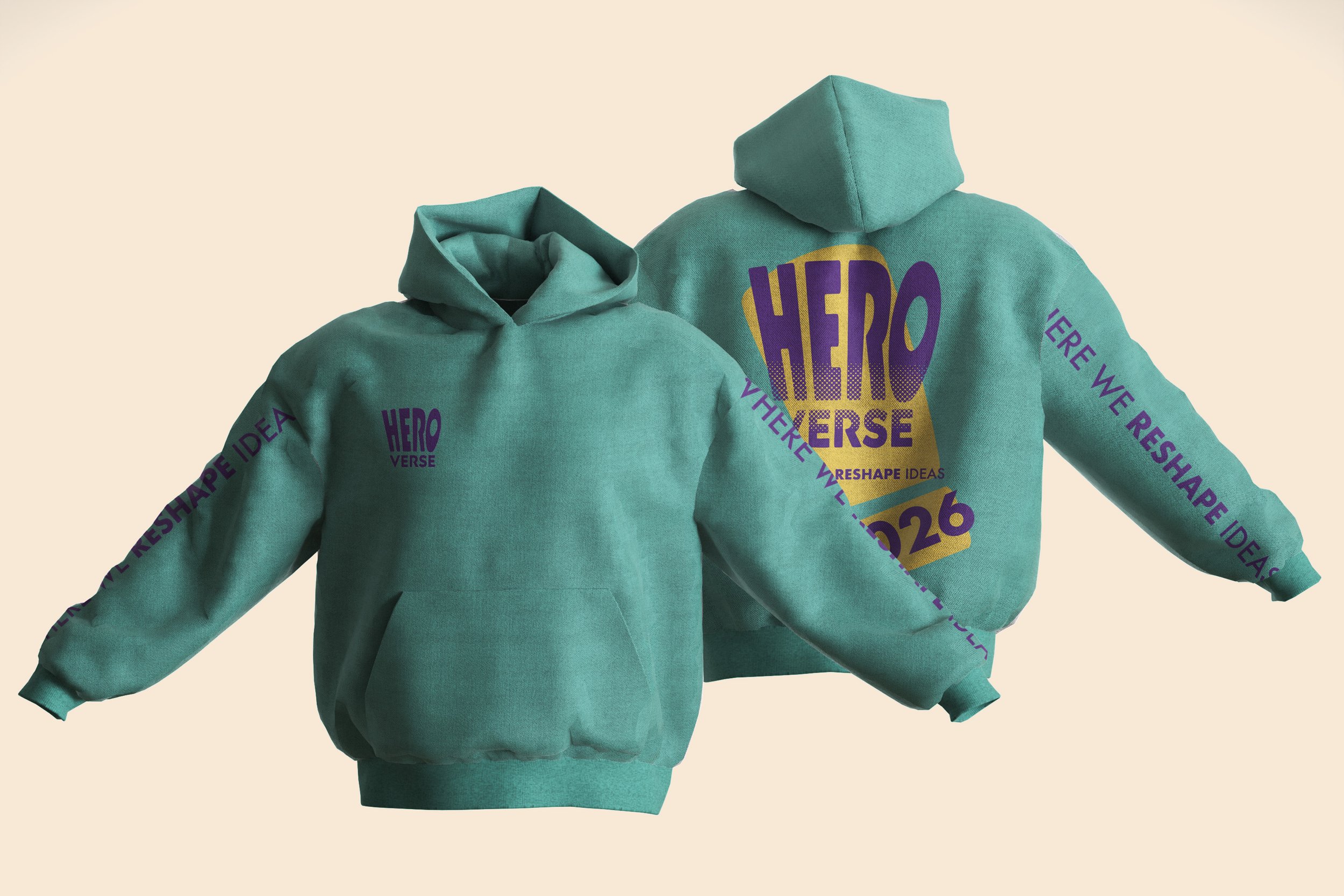
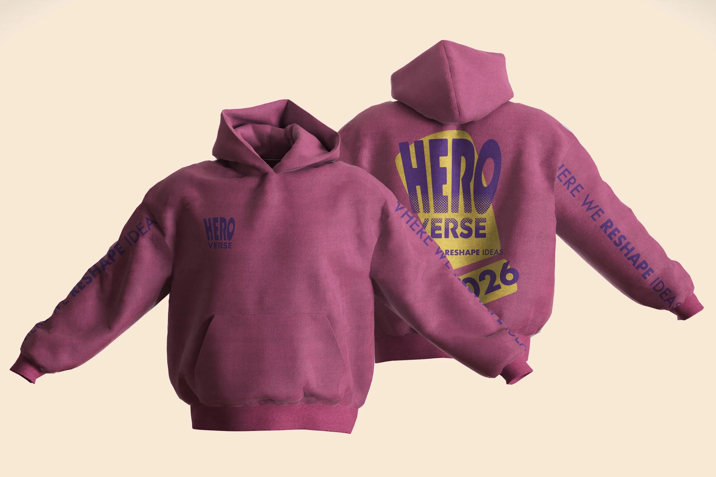
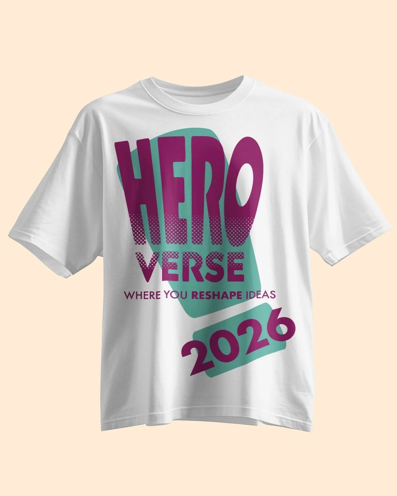
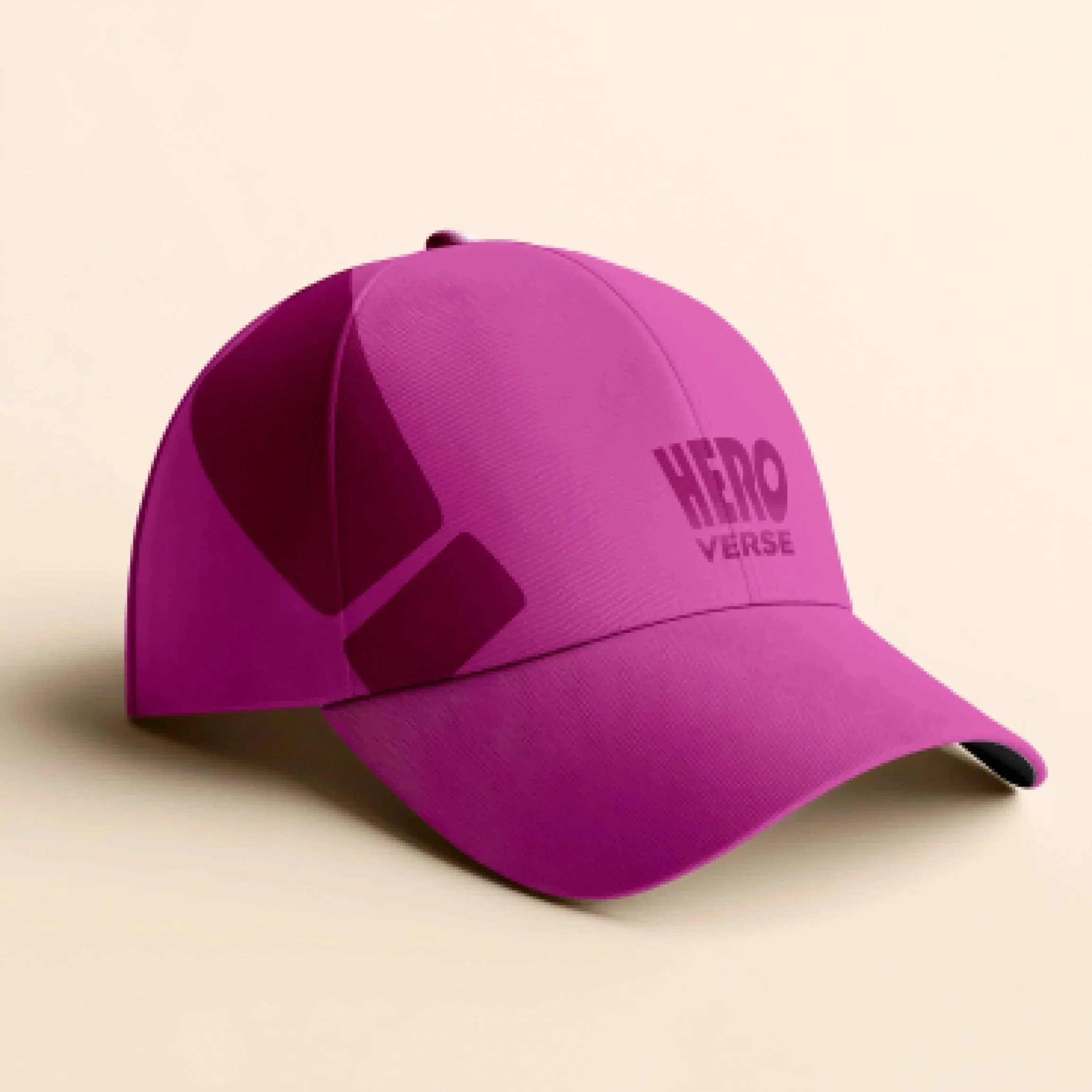
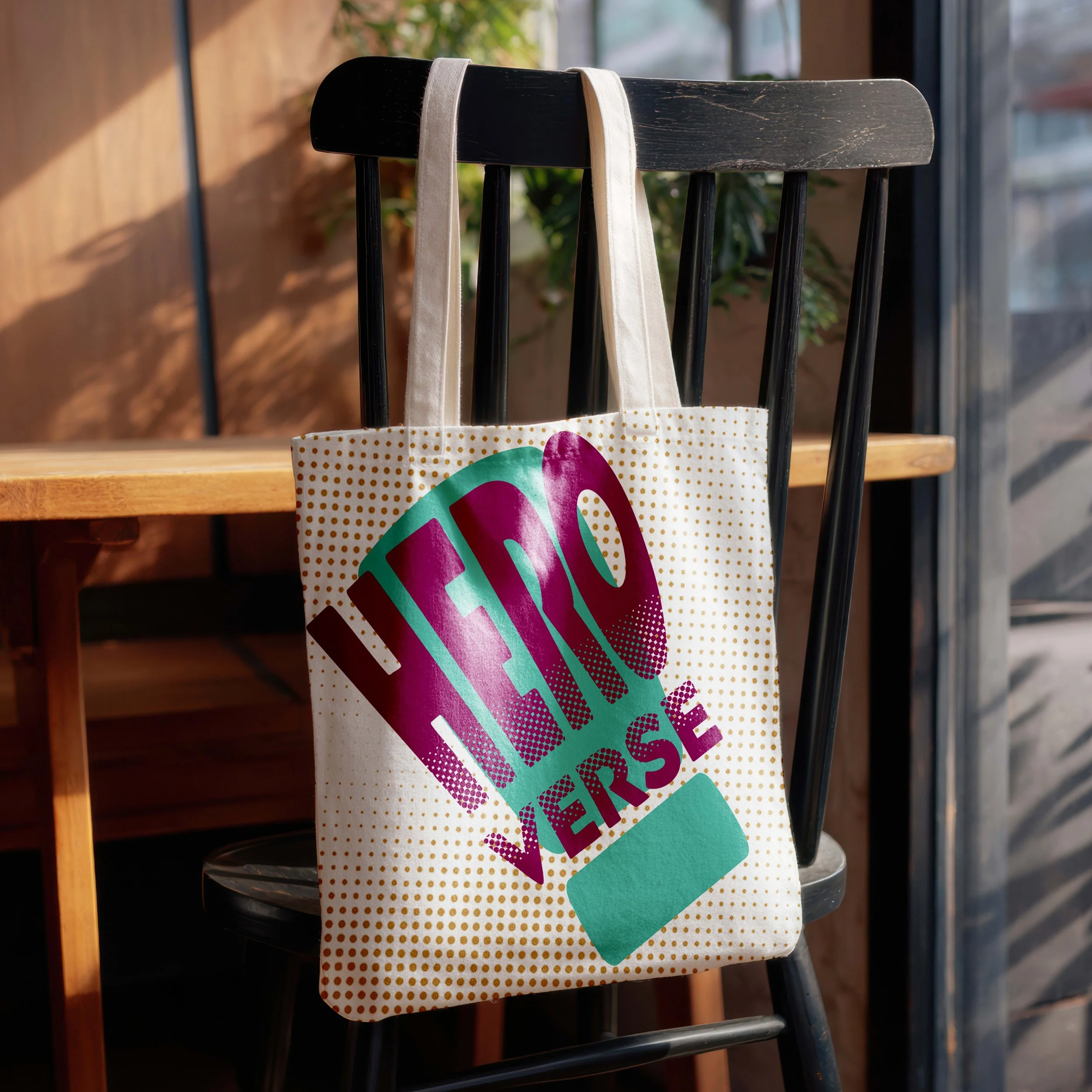
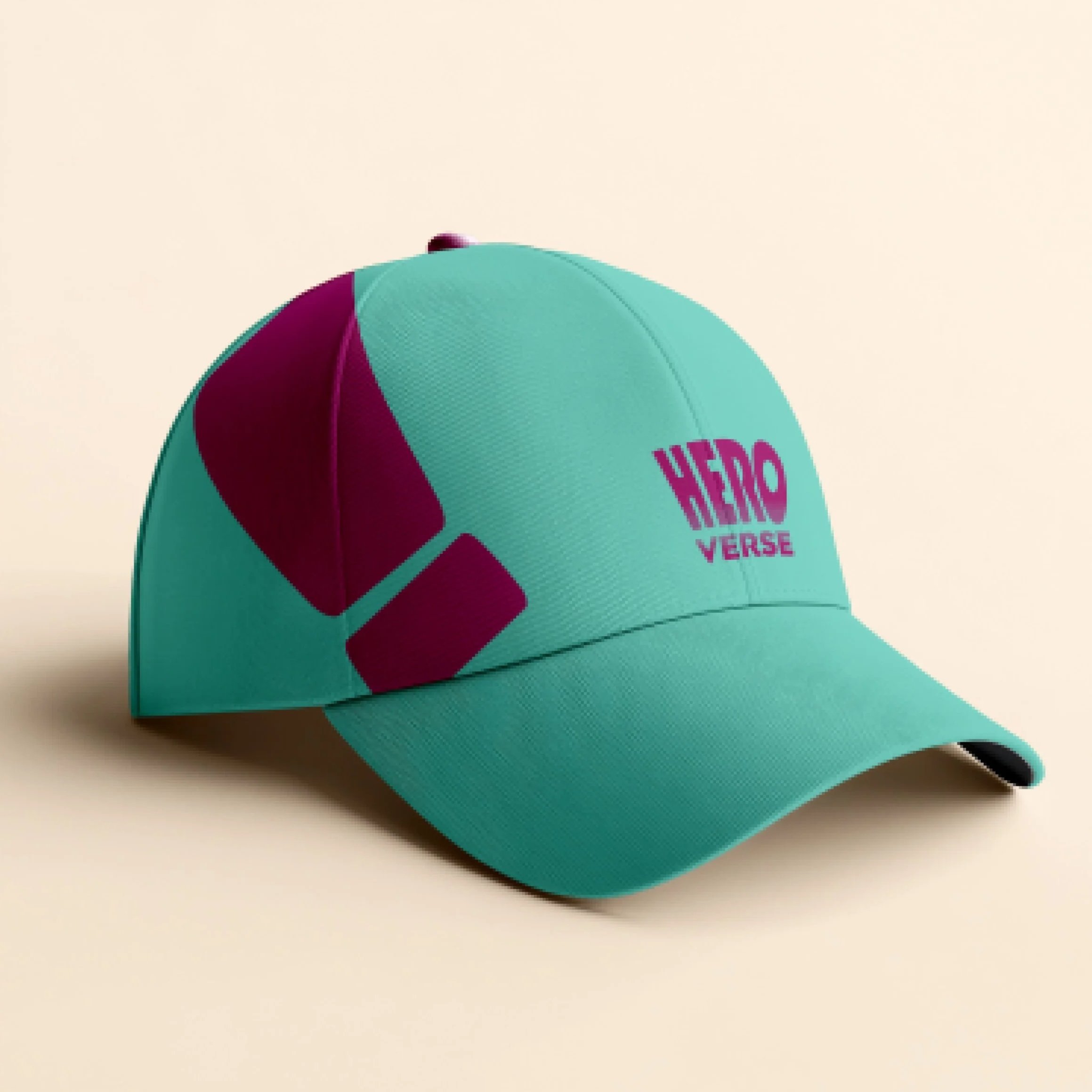
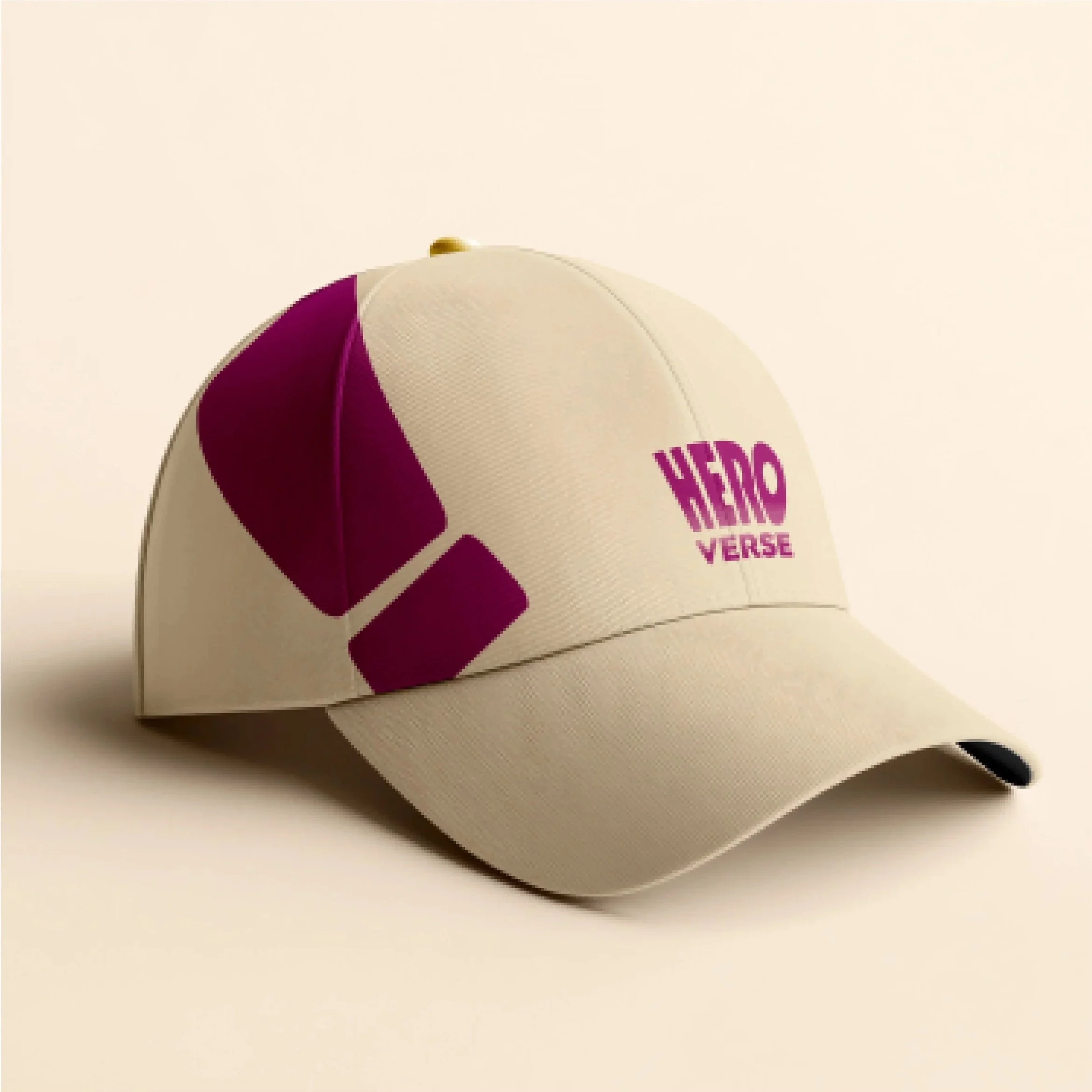
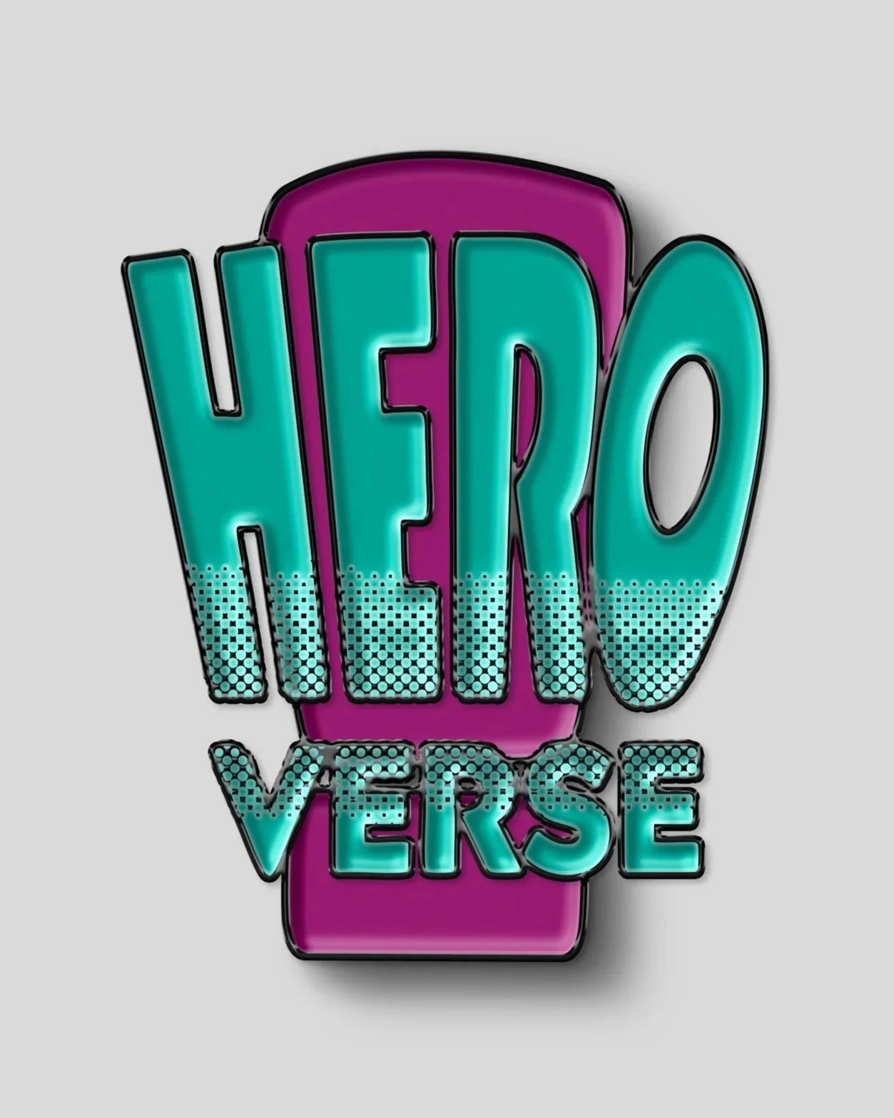
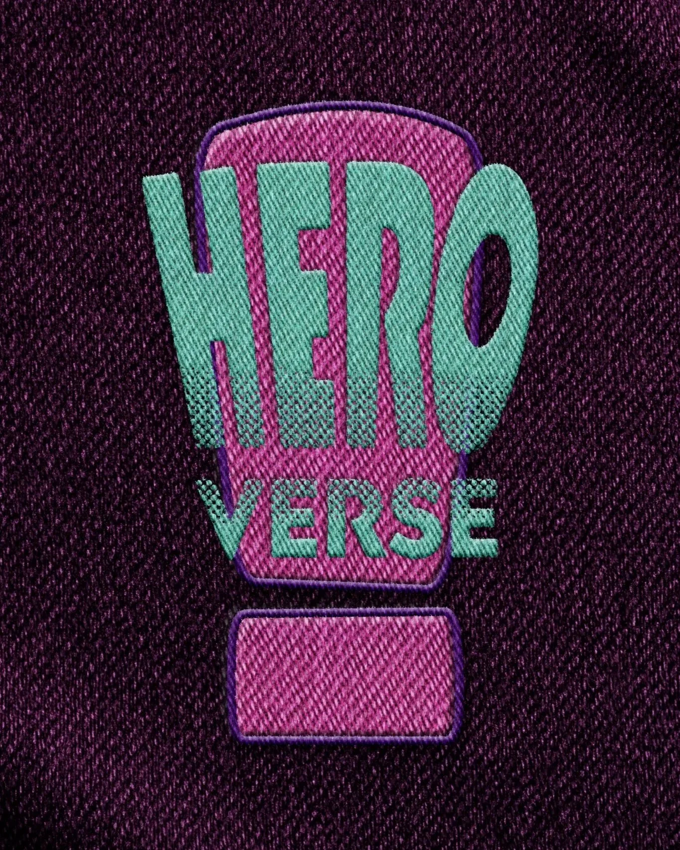
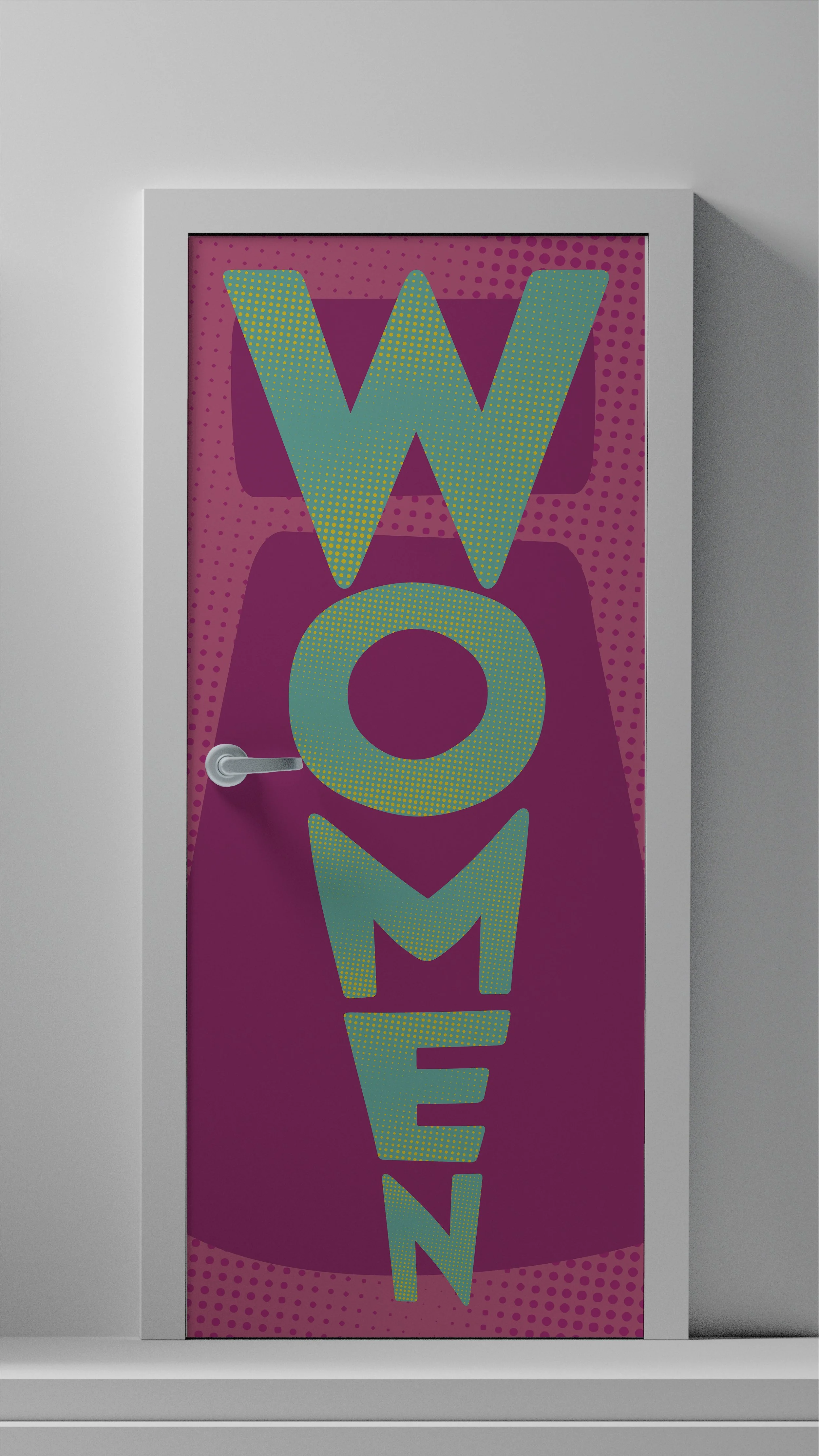
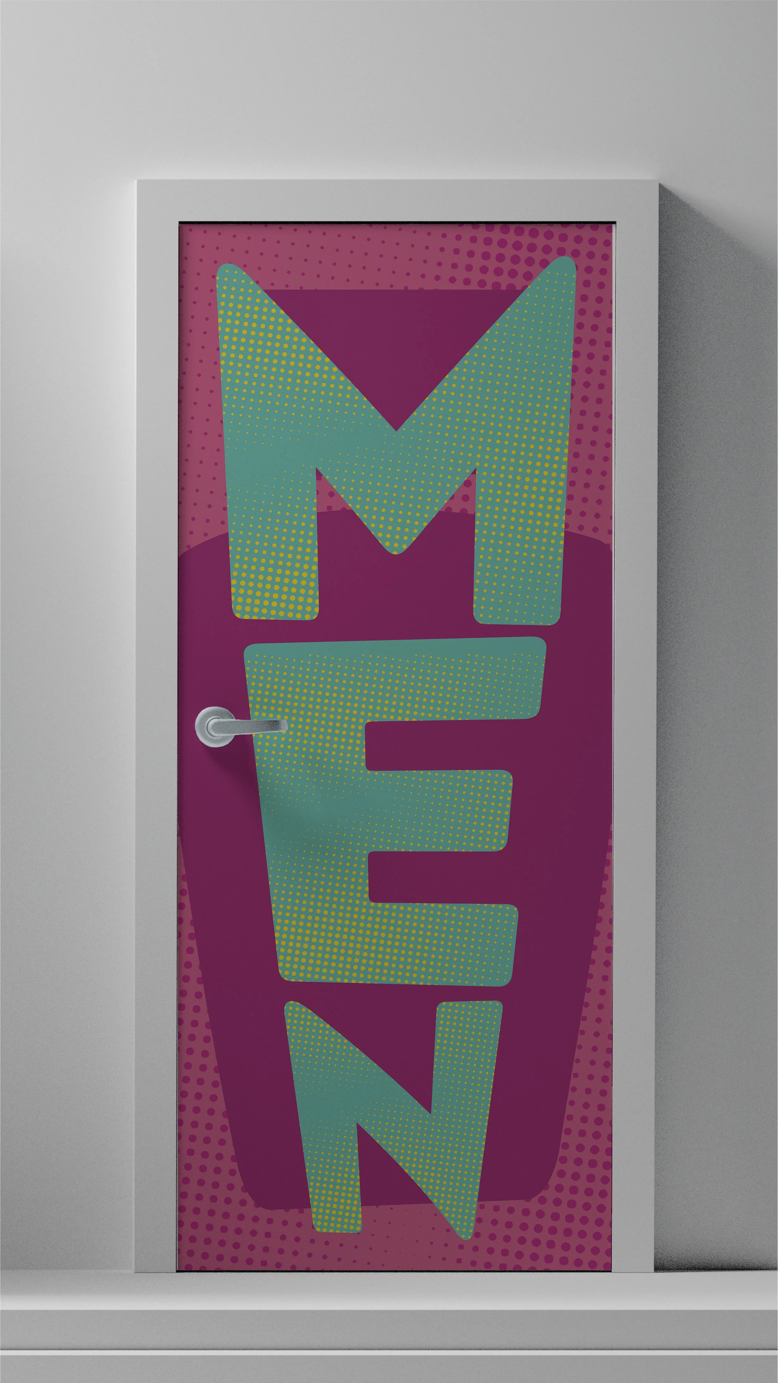
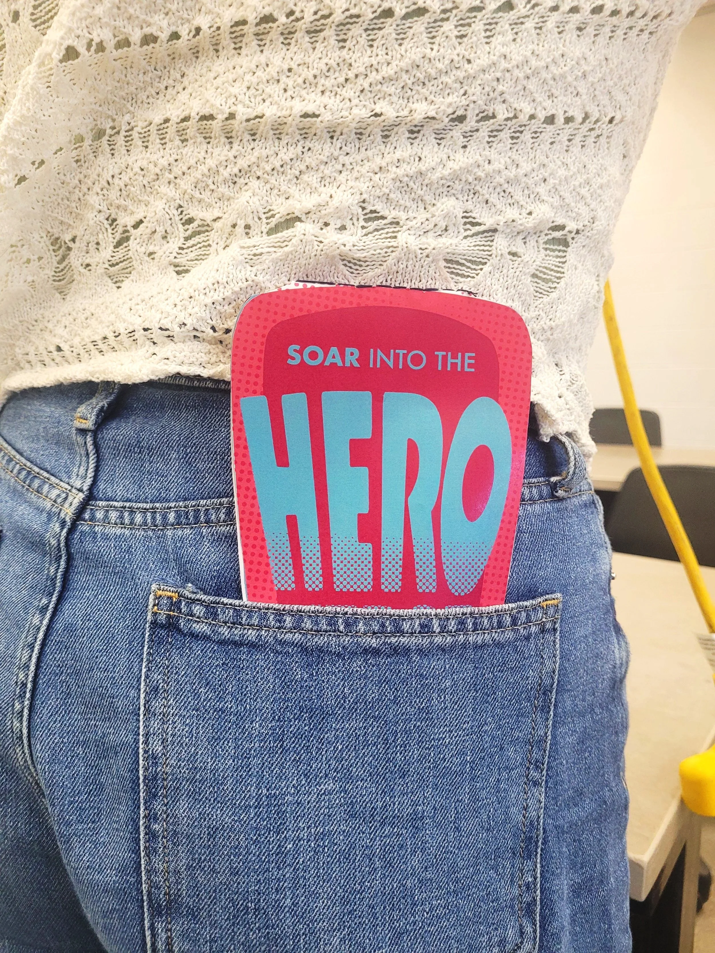
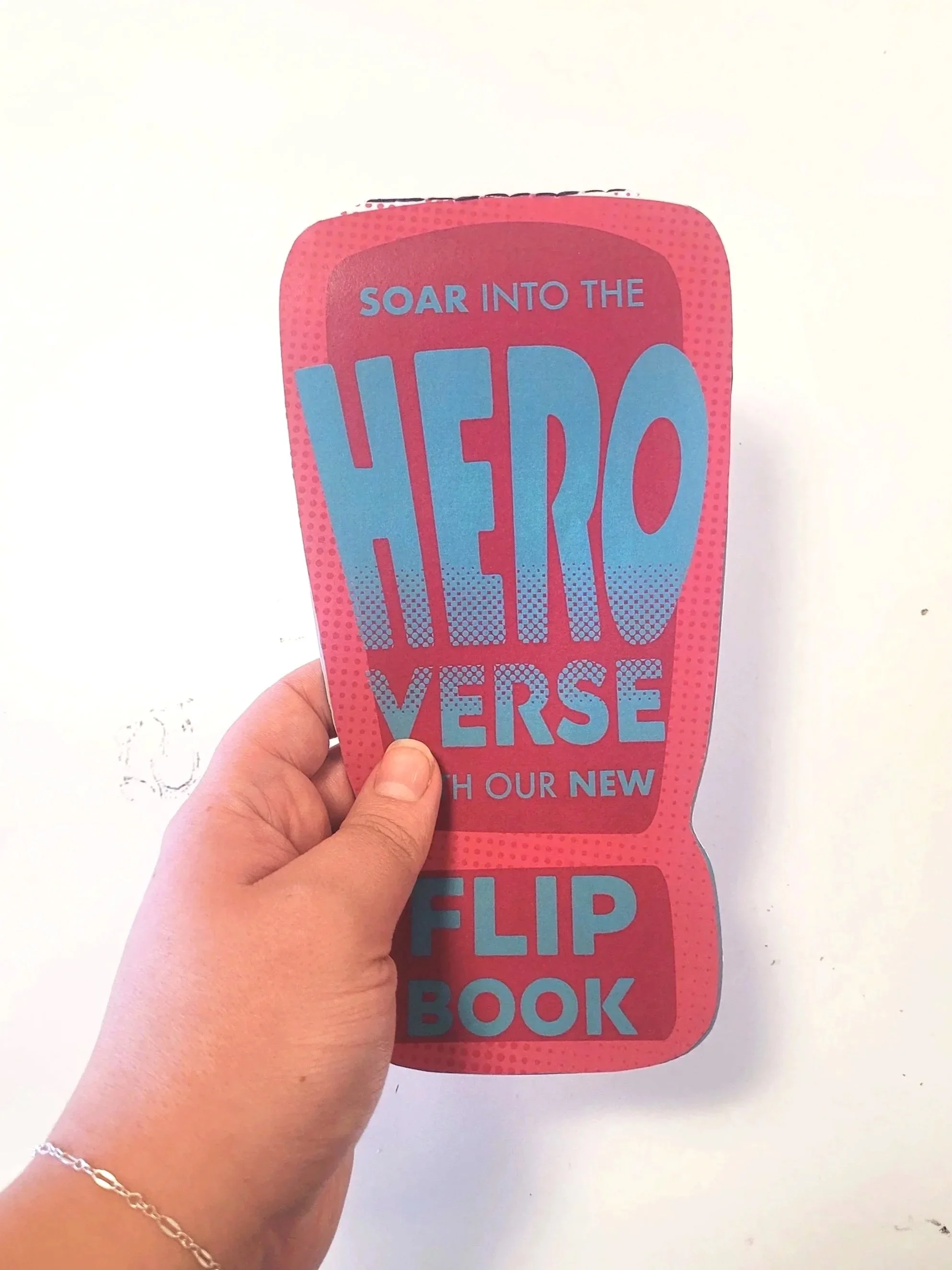
The HEROVERSE logo uses bold, reshaped typography paired with a halftone gradient to instantly connect to classic comic visuals. The halftone effect nods to vintage comic printing while visually representing our theme of “reshaping ideas”, the dots stretch, fade, and transform, echoing the evolution of hero narratives. The dynamic letterforms reference comic onomatopoeia and align with our exclamation-mark symbol, reinforcing energy, empowerment, and breaking boundaries. Overall, the logo blends familiar comic tradition with forward-thinking expression, capturing HEROVERSE as a space for creativity, identity, and transformation.
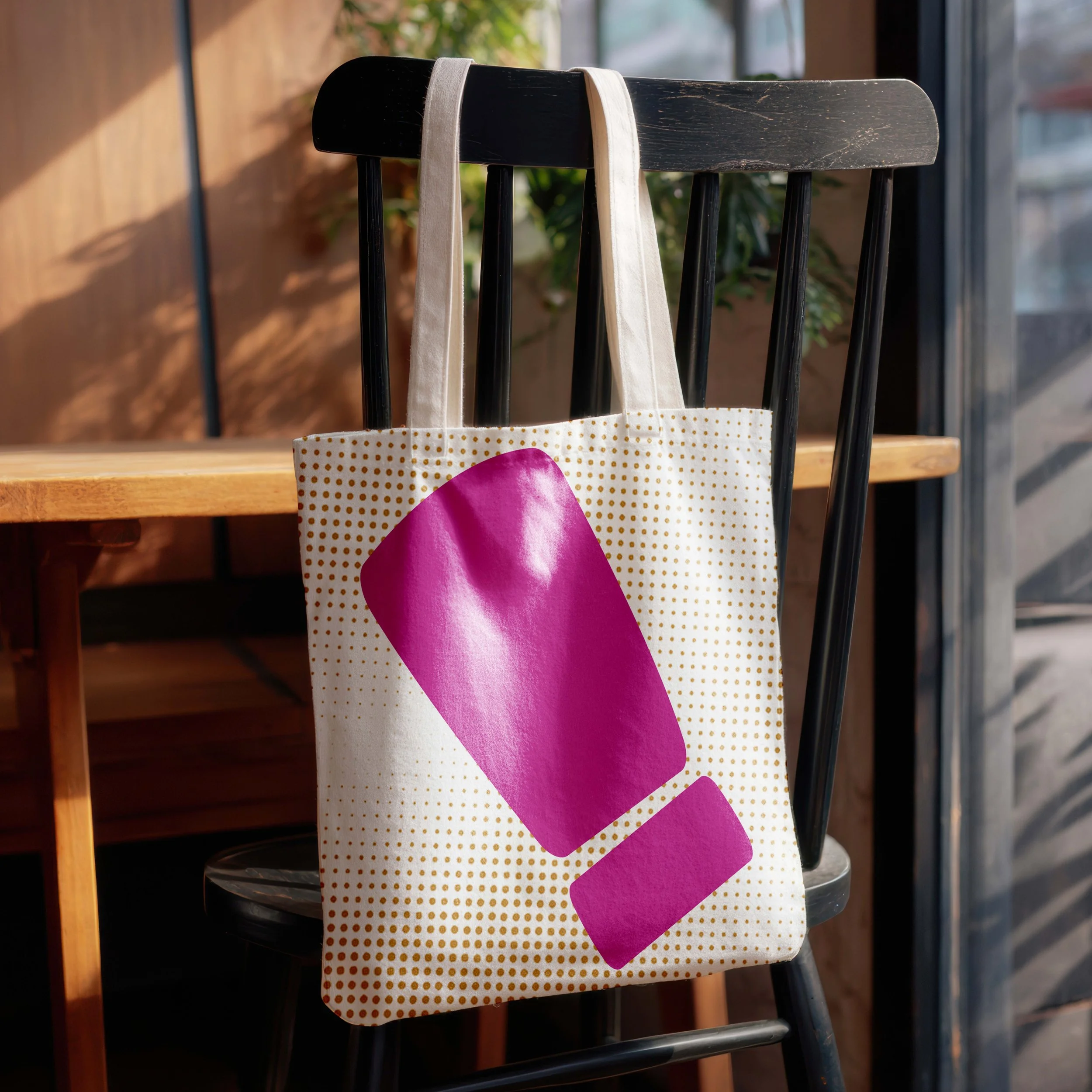
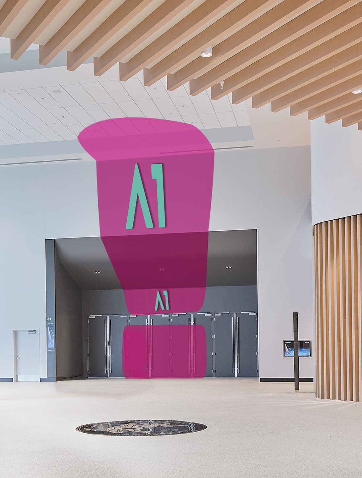
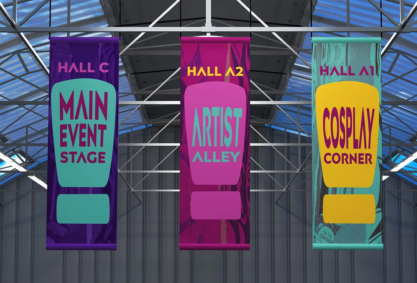
The exclamation mark functions as the primary symbol of the brand. It merges two things at the heart of HEROVERSE: Comic onomatopoeia, the punchy language of action and expression. The event’s purpose, which is to uplift voices, shout representation into the world, and call attention to new narratives. The exclamation mark becomes a visual device used throughout signage, merchandise, passes, and digital touchpoints. It acts as an anchor that ties together the energy of comic culture with the empowerment goals of the expo.
Promotional Materials
Social Media
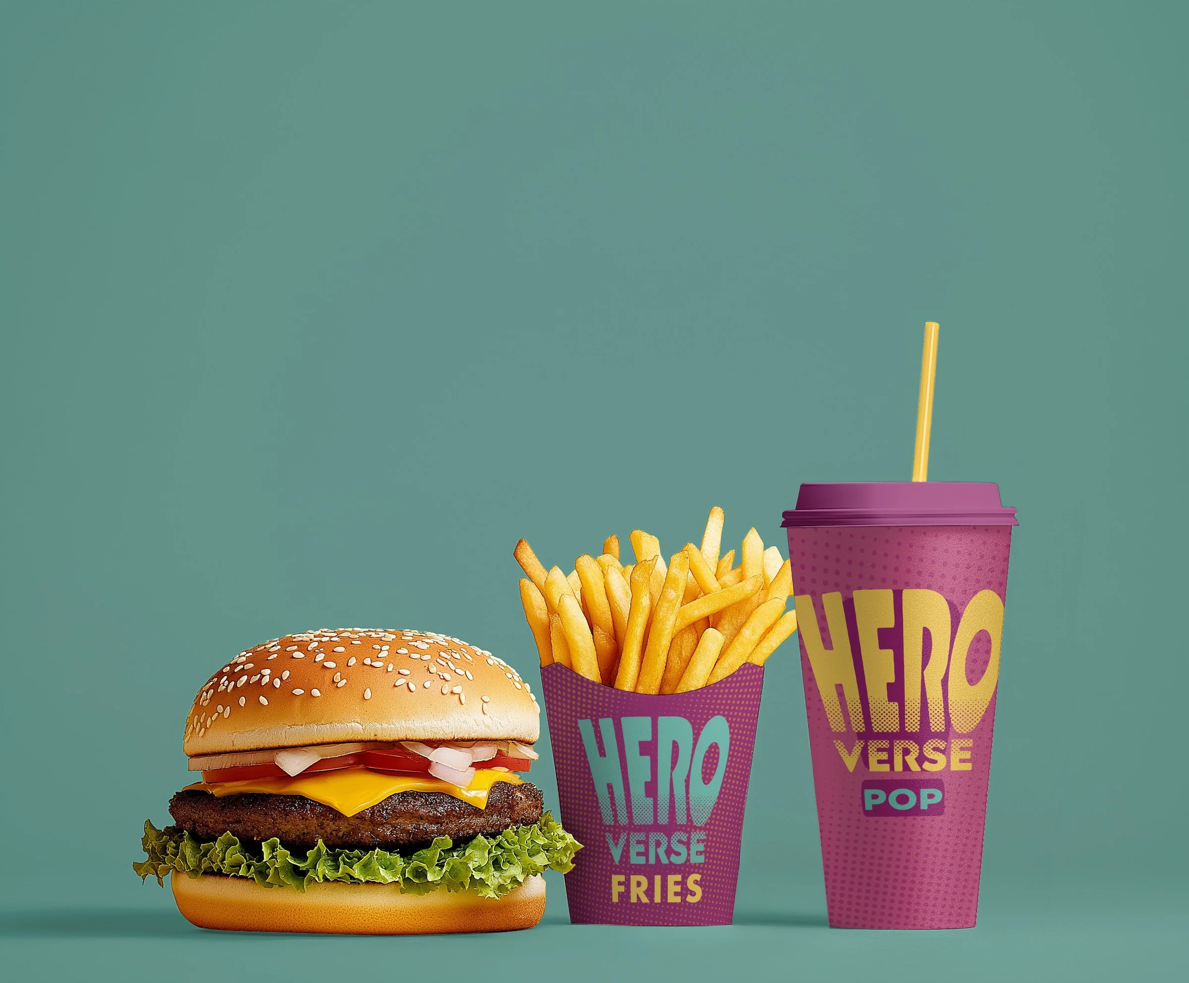
Merchandise
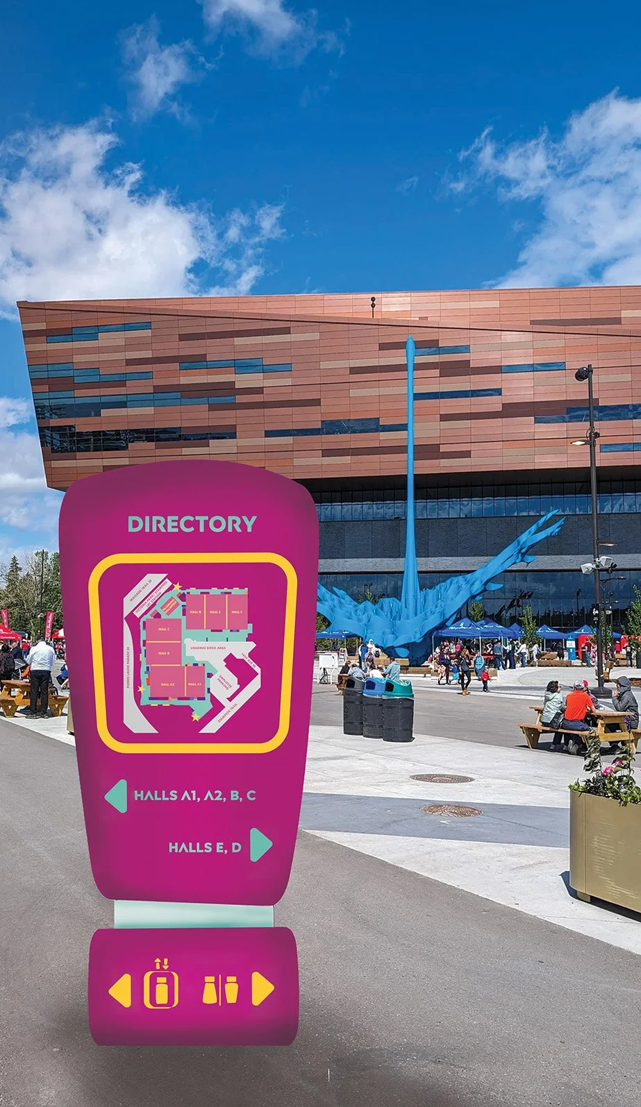
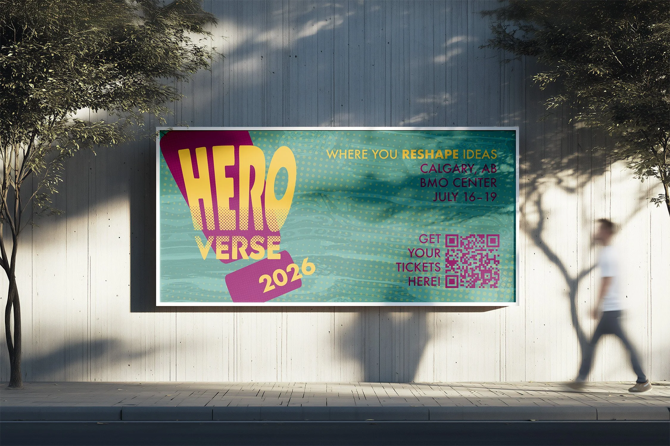
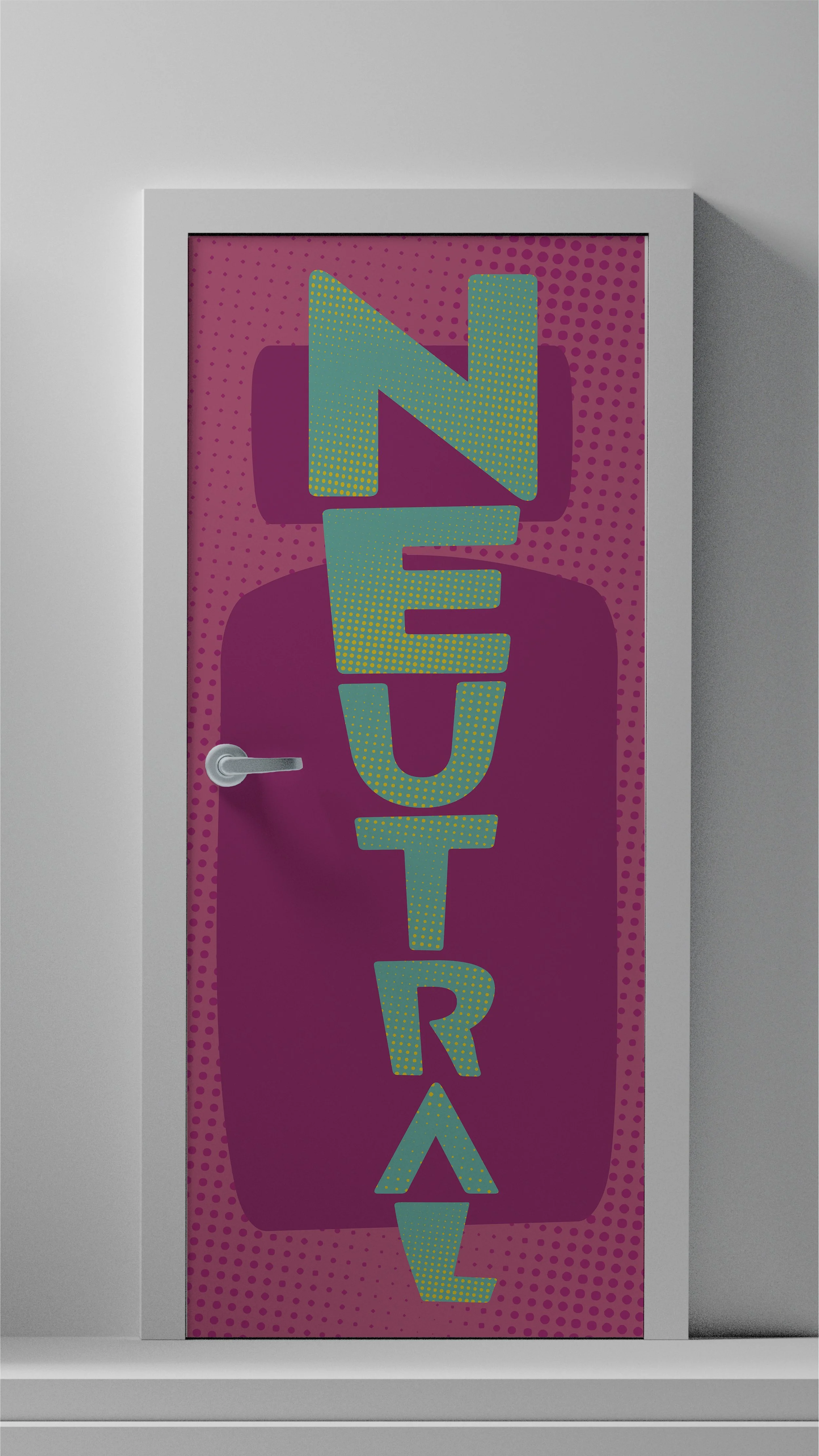
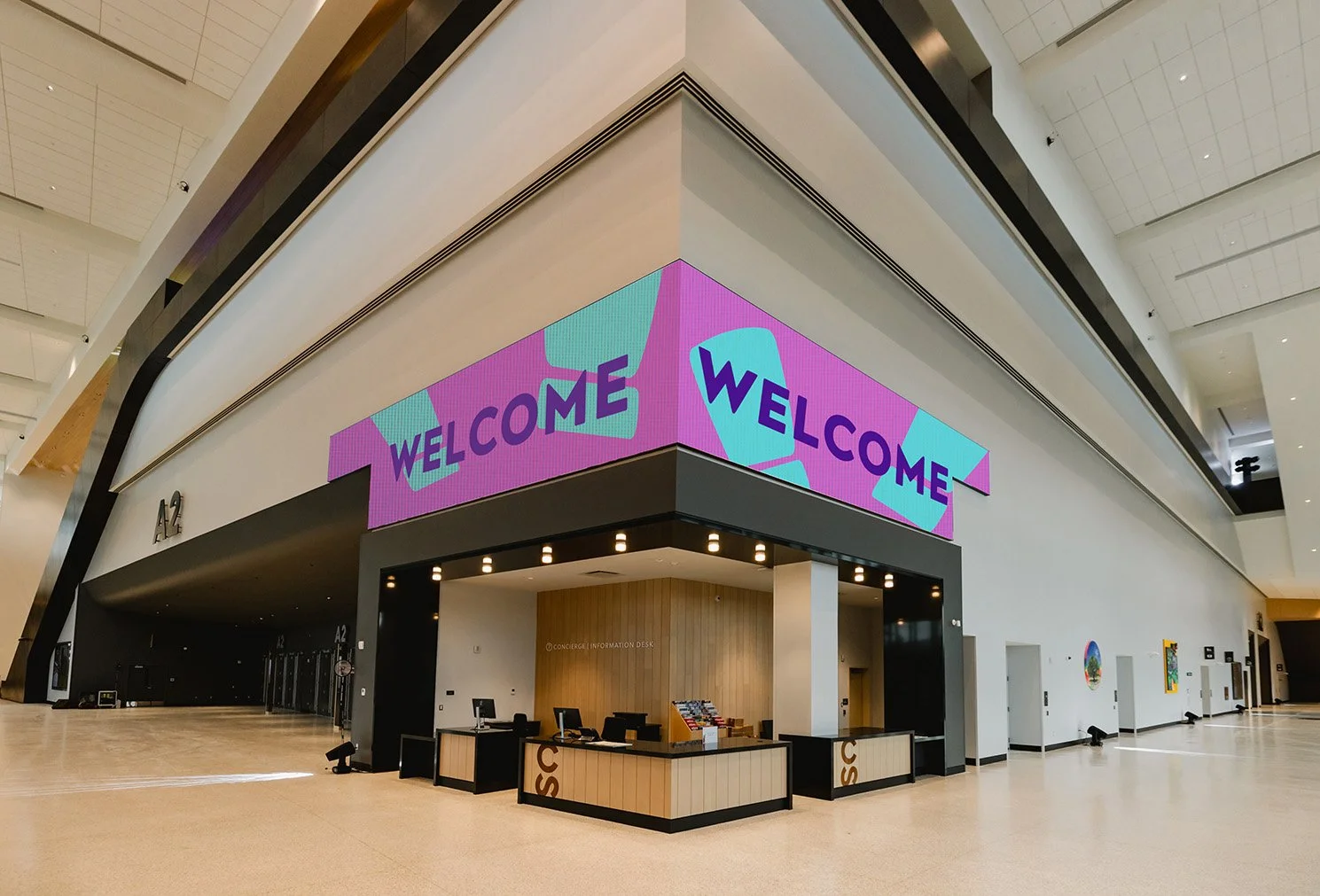
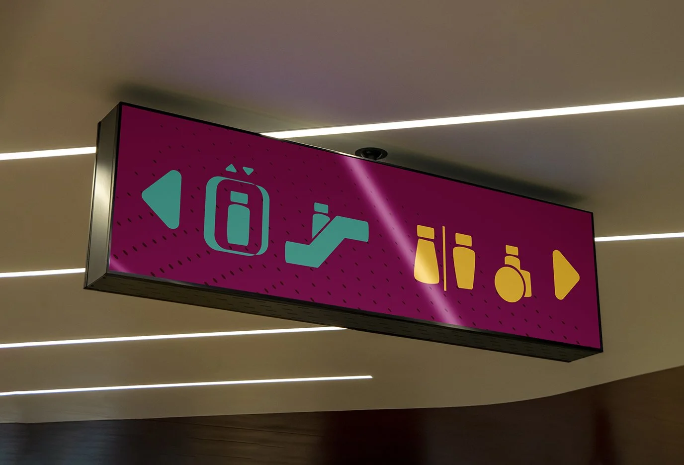
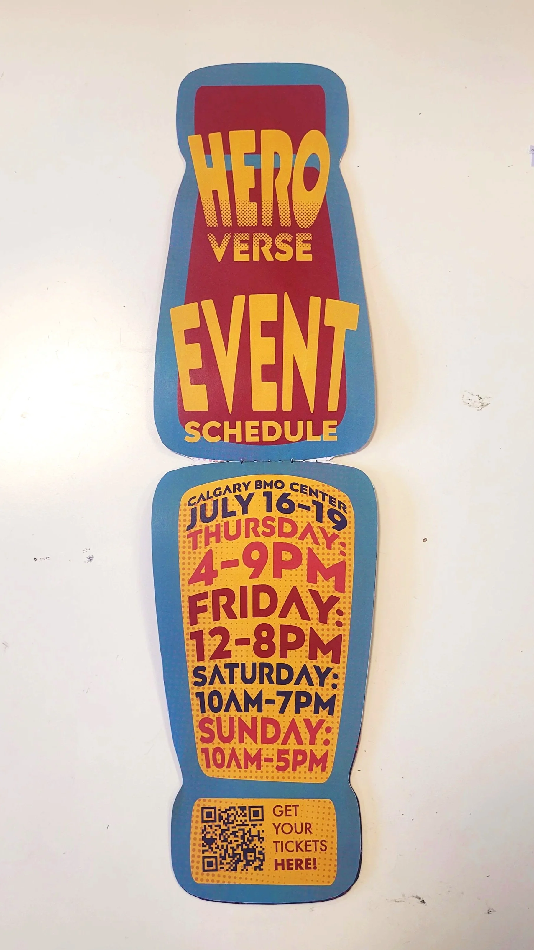
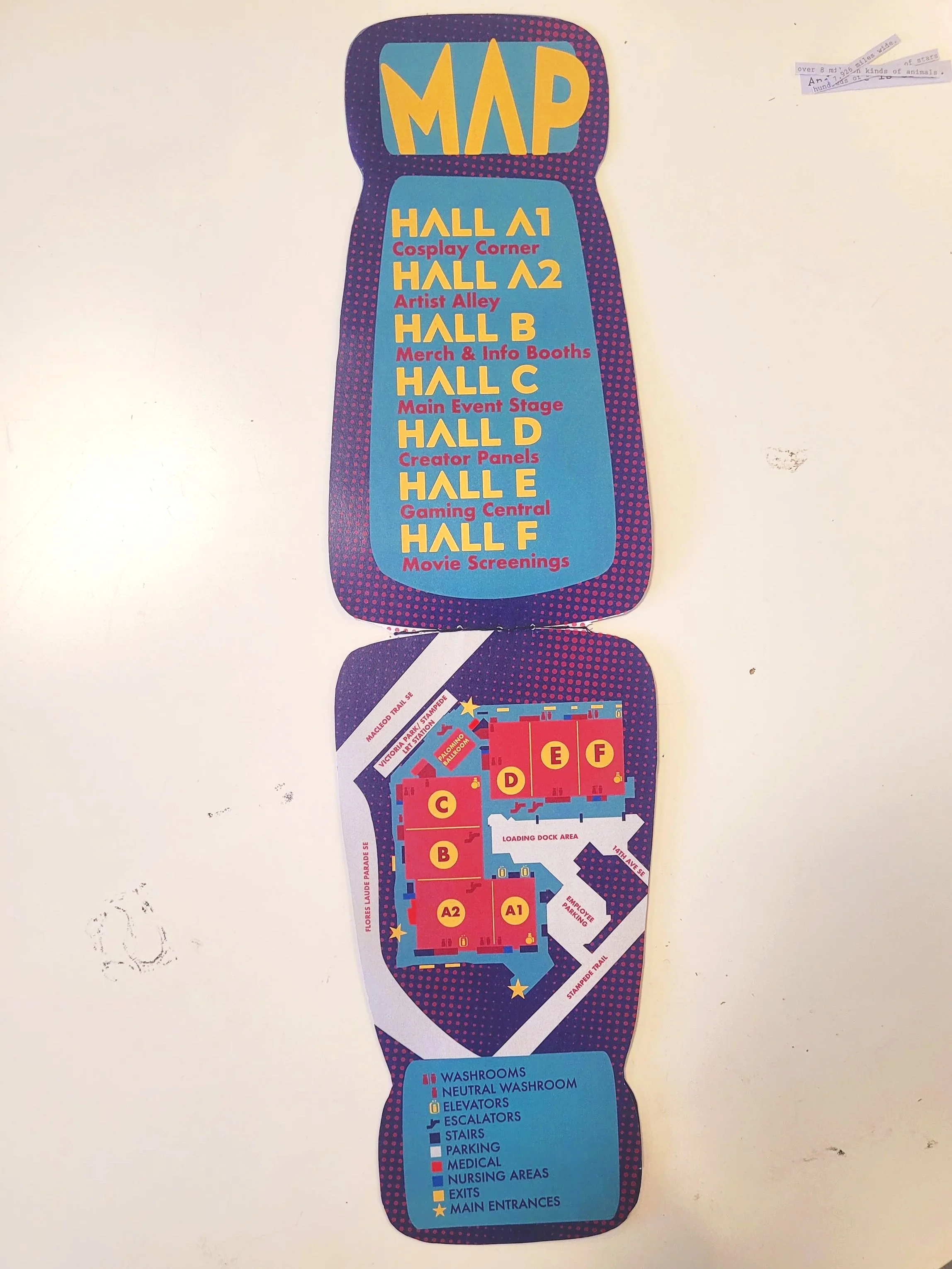
Way-finding & Signage
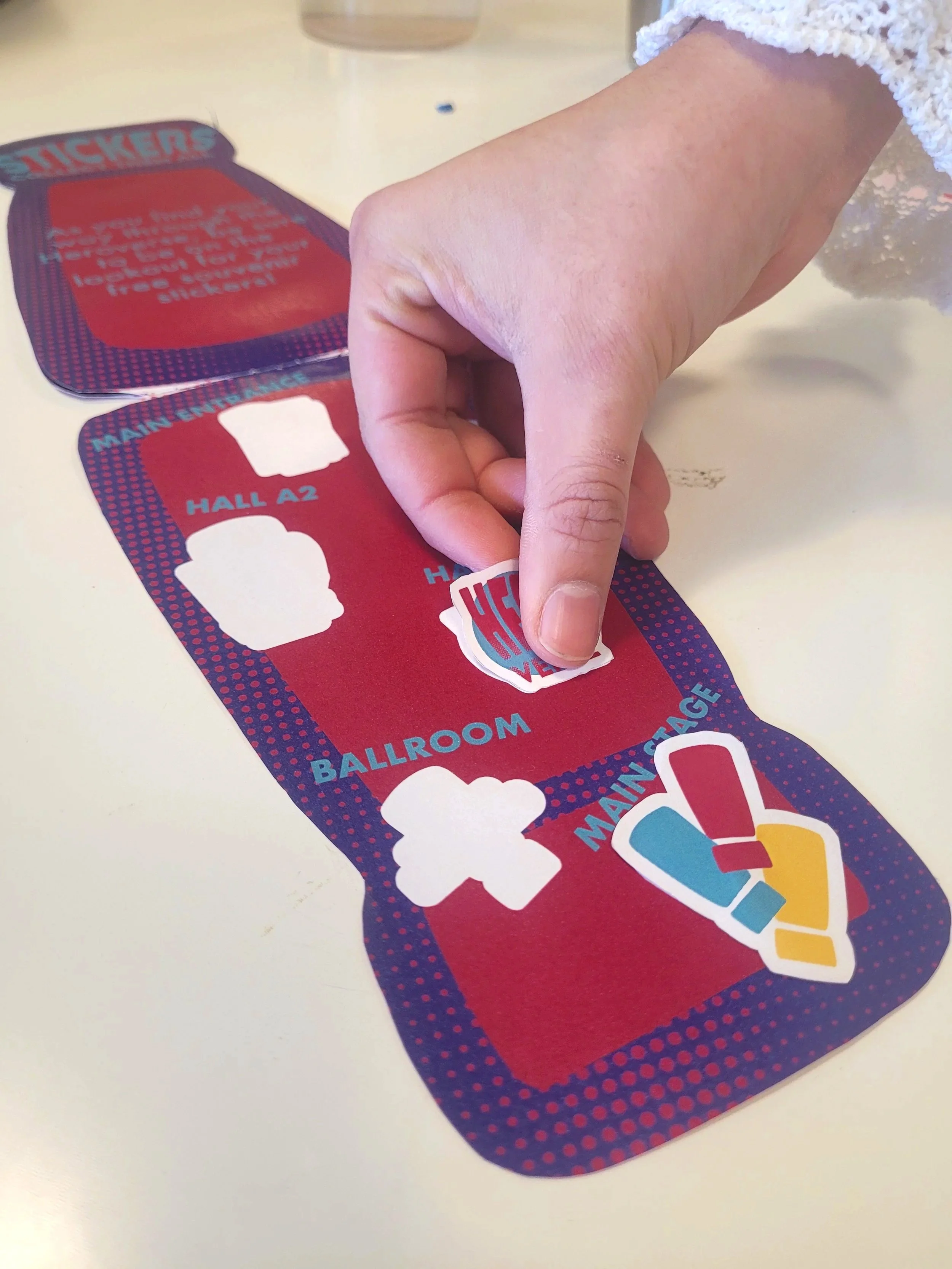
Informational Flipbook & Sticker Sheet
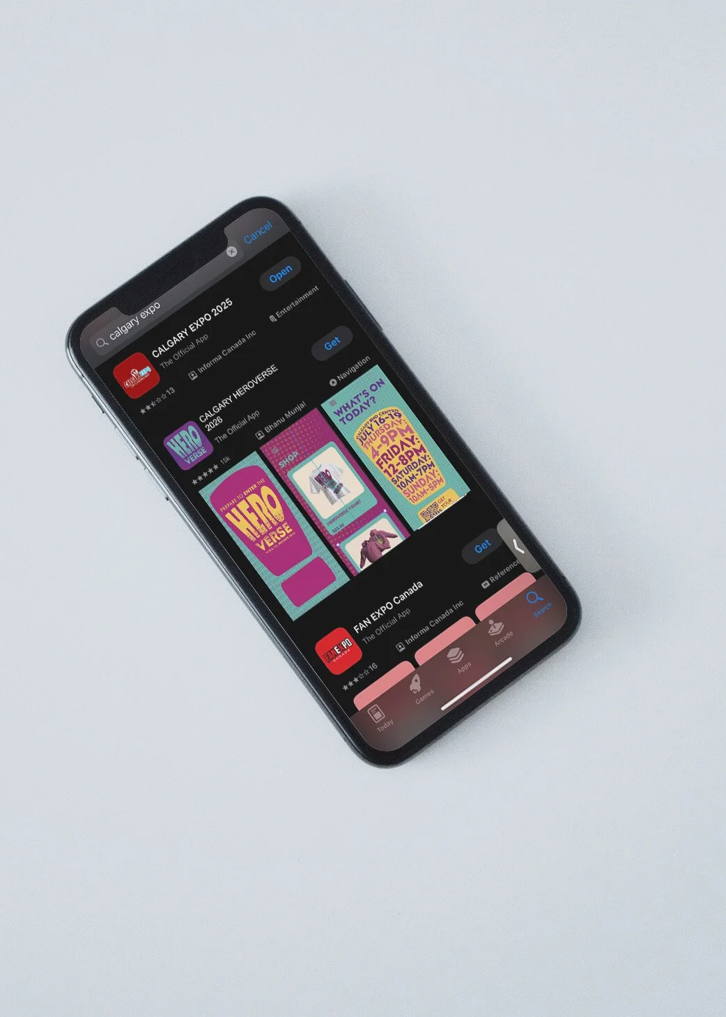
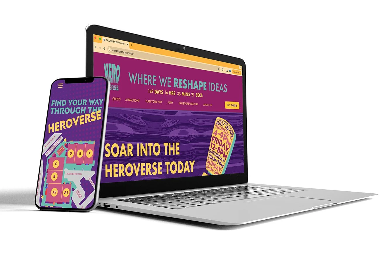
App & Website